
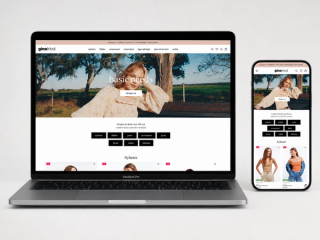
Redesigning Ginatricot
Designed during my time at Oakwood Creative this project was developed in collaboration with the design & dev team.
The work focused on rethinking key parts of the Gina Tricot digital experience through a redesign that brought together campaign storytelling, product discovery and a more cohesive shopping journey across desktop and mobile.
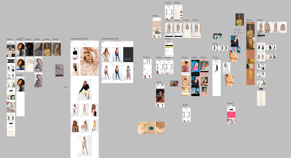
Exploring different directions
The early concept phase focused on testing different visual directions, navigation patterns and product-discovery layouts.
These explorations helped shape a clearer structure for the redesign and establish the balance between inspiration, usability and commercial clarity.
This phase was developed collaboratively within the agency team, with multiple concepts used to evaluate how the experience could feel more flexible and modern across different touchpoints.
A more editorial and engaging first impression
The landing page was redesigned to create a stronger connection between campaigns, new arrivals and category entry points.
Large visual moments help establish the seasonal tone, while product-focused sections and curated content blocks guide visitors naturally into the shopping journey.
The result is a homepage that feels more expressive while remaining easy to navigate.
Clearer product discovery
The product listing experience was redesigned to make browsing feel more structured, visual and easy to scan.
A clearer layout, improved hierarchy and more considered filtering help customers move through products with less friction, while allowing promotional and editorial moments to sit more naturally within the page.
The redesign aimed to support both inspiration and efficiency—making it easier to browse while keeping the overall experience visually engaging.
Product information with a calmer structure
The product page was redesigned to give imagery, product details and purchase actions a clearer relationship.
Larger product views, organised information and simplified option selection help customers focus on the item while making sizing, colour and related products easier to understand.
The updated direction creates a more confident and considered purchase experience.
The redesign brought together editorial expression, product clarity and a more unified shopping journey across key parts of the Gina Tricot website.
Developed in collaboration with other designers at Oakwood Creative, the project focused on making the experience feel clearer, more flexible and more aligned with the brand’s visual direction.