
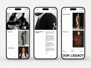
A digital expression of Our Legacy
Designed during my time at Oakwood Creative, this project explored how Our Legacy’s distinct visual identity could be translated into a clear and flexible online experience.
My contribution focused on early design exploration, page concepts and key customer-facing experiences across desktop and mobile.
Our Legacy has a strong and recognisable visual language built around restraint, experimentation and editorial imagery.
The design direction aimed to preserve that character while creating a more consistent experience across campaigns, product discovery and editorial content.
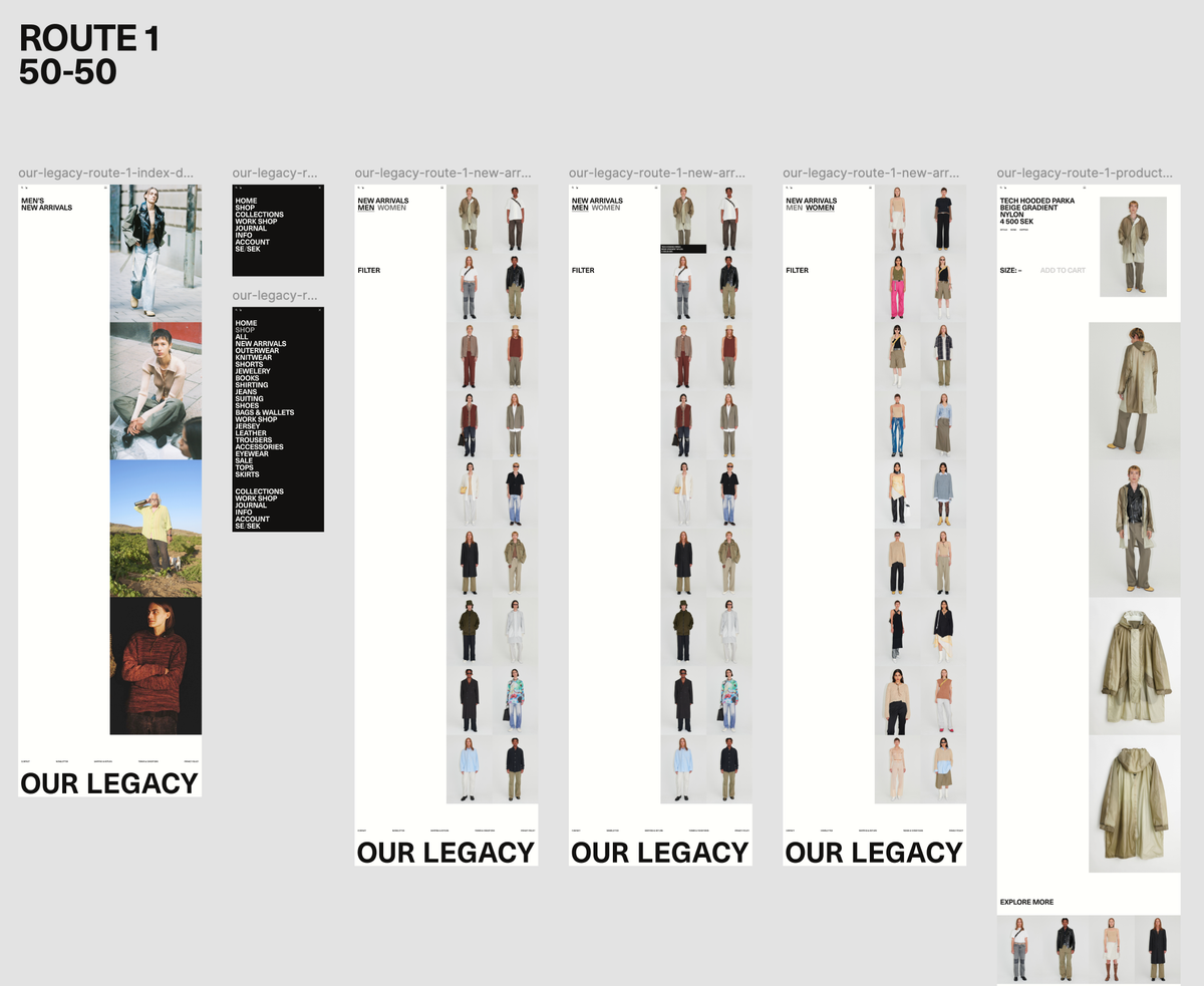
The project began with a broad exploration of layouts, image treatments and page structures.
Multiple routes were developed to test how campaign imagery, product content and navigation could work together while still feeling distinctly Our Legacy.
The early sketches helped compare different levels of visual expression—from more editorial compositions to simpler, product-led layouts.
Route 01
A spacious and editorial direction with strong shifts in image scale.
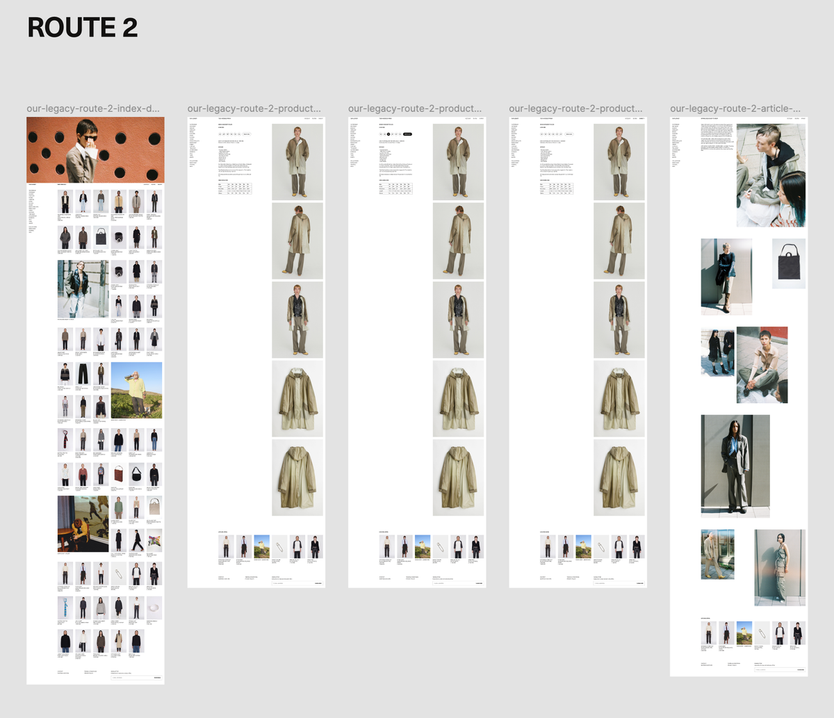
Route 02
A more compact approach that brings product discovery closer to campaign content.
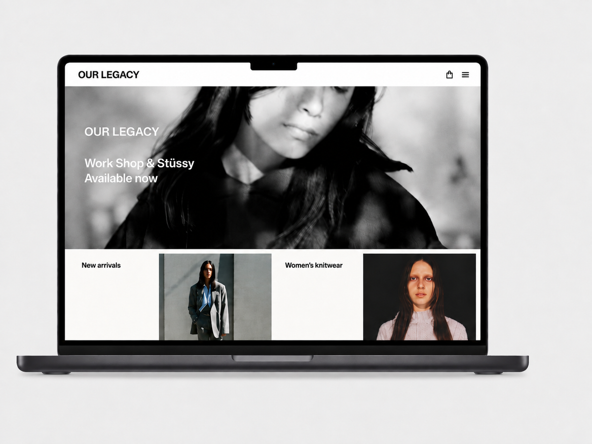
A flexible entrance into the brand
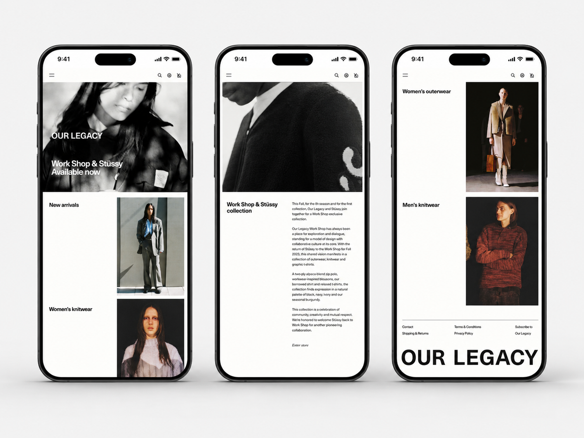
The landing page was designed as a modular composition where campaign stories, new arrivals and featured categories could be arranged in different ways.
Two hero directions were explored: a full-width campaign treatment and a split layout that creates a stronger relationship between text and imagery.
The rest of the page uses changes in scale and alignment to create an editorial rhythm while keeping products easy to discover.
Clear product discovery with a strong visual rhythm
The product listing page was designed around a consistent grid that gives each item space and keeps the collection easy to scan.
A restrained information hierarchy allows the product imagery to remain central, while category navigation and filters support quick movement through the collection.
Several approaches were explored for headings, navigation and related content to understand how much information could be introduced without making the page feel crowded.

Product information without distraction
The product page places the item, its details and the purchase choices within a calm and direct layout.
The design gives the product image a strong presence while keeping sizing, colour, description and delivery information easy to understand.
Different product types and content lengths were explored to ensure the structure could work consistently across clothing, accessories and items with fewer available options.
Bringing editorial content and product together
The journal experience was designed to support longer stories while maintaining the same restrained visual language as the rest of the website.
Text, campaign imagery and featured products are arranged within a flexible composition that allows each story to develop its own pace.
The layout creates a natural connection between editorial content and product discovery without making the article feel commercial.